Improving Readability of 3D Label
Company: HP Labs (2018 - 2021)Team: Jiwon Jun, Craig Sayers
My Role: defining research goals, designing 3d models for experiments, data collection & documentation, font design
Summary
3D-printed parts can be individualized with labels composed of digits and alphabets. Labeling is beneficial for tracking and personalizing parts, and labels need to be both human and machine-readable. In contrast to 2D labels printed on a flat surface, there are various factors affecting the readability of the 3D labels. This work aimed to define the factors through experiments and find solutions to improve the readability. Based on the findings, we designed a customized “HP 3DP Courier Prime Sans” font optimized for labeling MJF 3D parts and released it to our customers. We also filed three patents and invented an automatic labeling system for a 3D-printing software and the font was applied to the system.
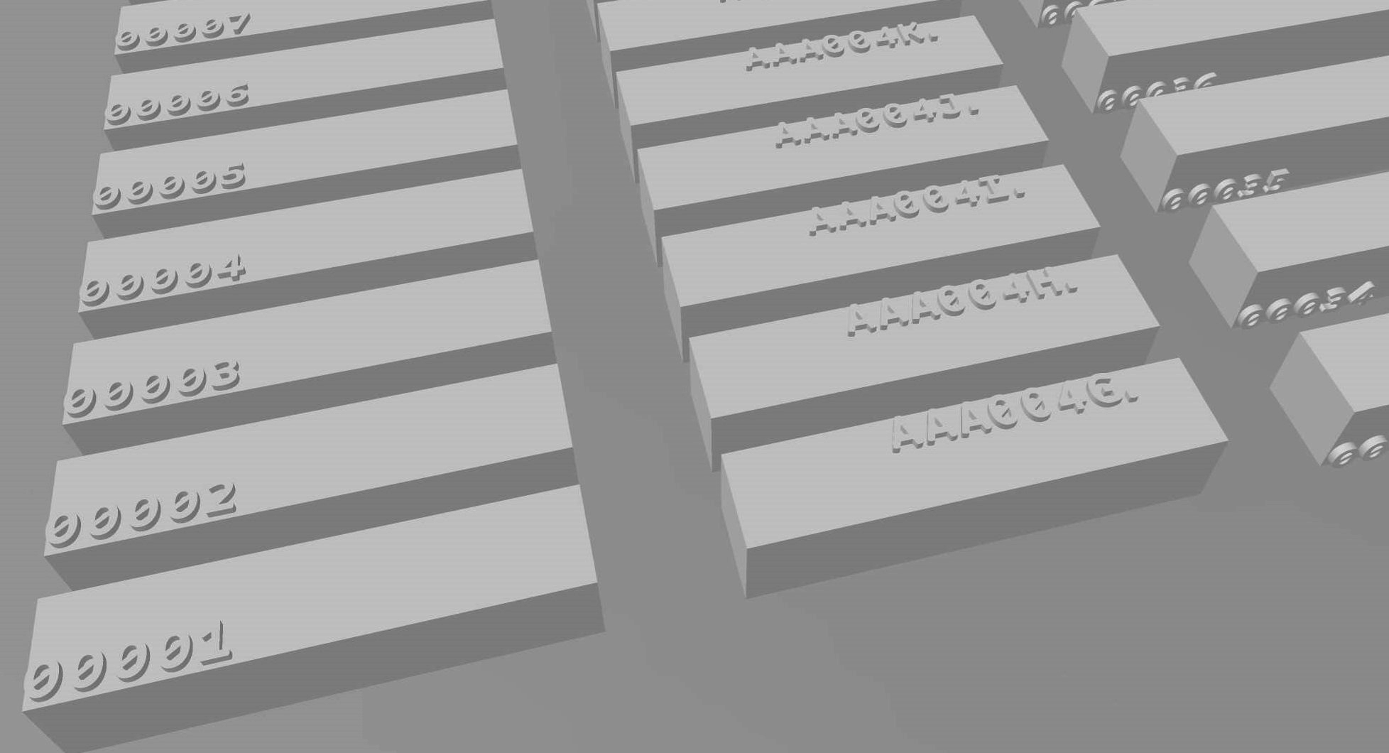
An example of 3D models with automatically generated 3D ID labels
ProcessIn monochrome 3D-printing, labels are created by embossing or debossing characters onto a part’s surface. Each character needs to be set in an optimized shape and size to make the label readable while it fits into the limited space on the parts. The readability of labels is defined by how easily and correctly the characters are identifiable by humans and machines. We investigated the factors affecting the label’s readabilities by conducting a series of experiments with PA12 parts produced by the Jet Fusion 5200 printer. The parts were designed with characters on a planar surface, and its readability was qualitatively assessed after cleaning. We also dyed some of the parts in black to compare it with non-treated parts.
3D model designed for comparing the appearance of characters printed at different angles. A set of models were produced with Grasshopper 3D.
In an experiment to compare the appearance of the same font printed at 7 different
angles (0, 30, 60, 90, 120, 150, 180 degrees), we found that the print orientation has a crucial impact on the readability of characters. Both the embossed and debossed characters printed at 0° (facing up flat) showed
the roughest surface finish among other orientations. The rough outlines of the letters caused by
the uneven surface were observed to make the characters less readable and less aesthetic overall. Also, the
stroke width of debossed characters was printed 0.2-0.3mm wider than other orientations, and as a result,
small positive elements like the triangular shape in “A” and “4” printed small and fragile. The characters
printed at 180° (facing down) showed the smoothest surface finish; however, the debossed characters were
printed visibly shallower than other orientations, and it slightly diminished its readability by reducing the contrast
between the letters and base area. 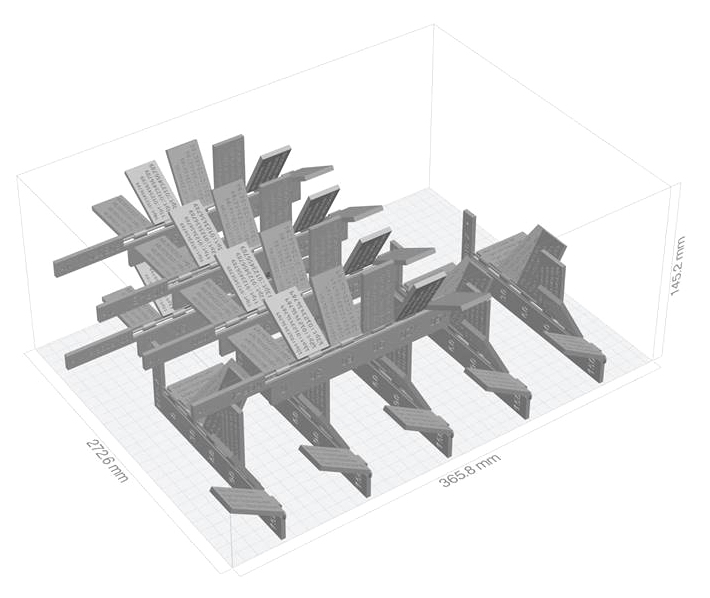
3D models set in a print bed for printing
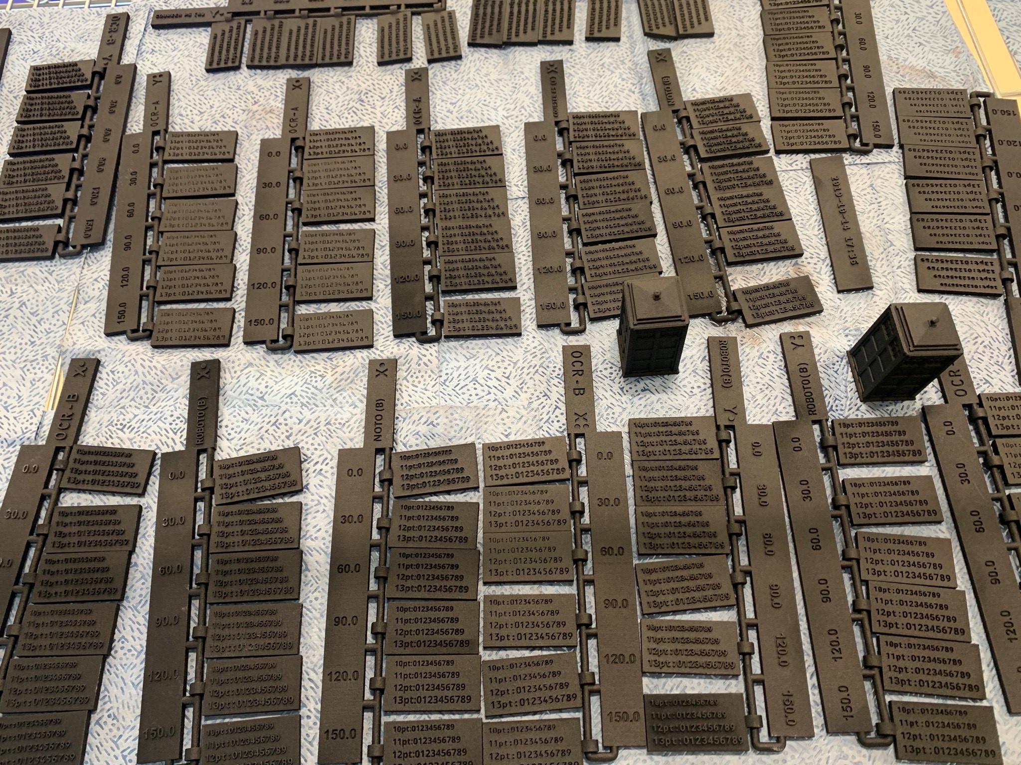
3D-printed parts were cleaned, washed, and dyed for qualitative assessment
The second factor we found is the font design. Fonts are generally divided into two categories,
serif font with extended ends on letters and sans-serif font without the decorative lines. The small details of
the serif fonts do not significantly contribute to the readability of characters, and it could be chipped during
cleaning. Thus, we decided to focus on the use of sans-serif fonts. In an experiment to compare the
appearance of digits printed in sans-serif fonts including OCR A, Roboto Mono Bold, Noto Sans Bold, and
Courier Prime Sans Bold (CPSB), we observed that Roboto Mono Bold and CPSB fonts result in robust
and readable characters in both embossed and debossed styles. The bold and mono-spaced versions of the
fonts were specifically preferred due to the thicker stroke width and wider letter spacing. The stroke width is
particularly important for small font details such as the period and the dots over “i” and “j”.
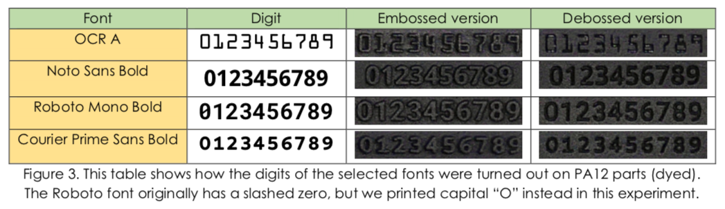
Furthermore, the individuality of characters is an important subfactor in font design, especially for making machine-readable labels. For example, some fonts have characters that are hardly distinguishable, such as lower case and upper case “O” and “0” (zero), leading to recognition errors. For this reason, we modified the CPSB font for use in the 3D printing software’s automatic labeling feature. While the Roboto Mono font is also machine-friendly, we selected CPSB due to its rounded edges and shorter height. This work is introduced with more details below. Regarding font size, we learned that it is challenging to pick a single best size for different fonts since each font is unique in its shape, ratio, and stroke width. A larger size could produce more robust and readable characters; however, it could be less space-efficient and less cosmetically pleasing.
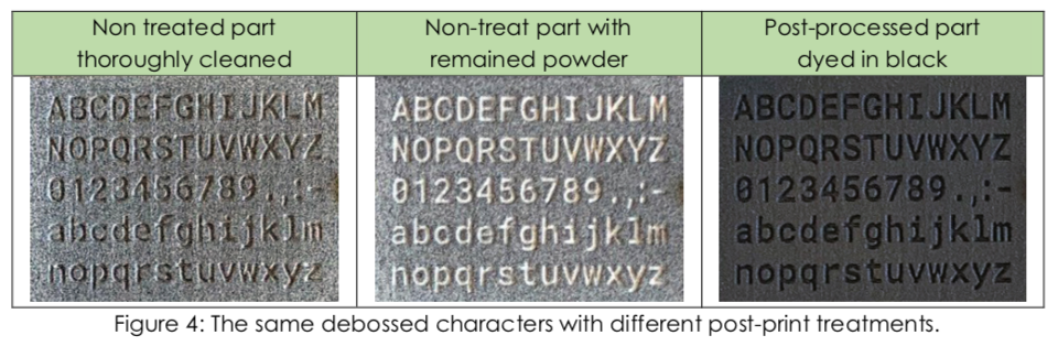
The third factor is post-printing treatments, including cleaning and post-processing. Non-uniform surface color and texture are unfortunate realities with the 5200, introducing noise that reduces the contrast between a character and its surround. Debossed text casts crisp shadows which can provide more contrast than embossed. Dyeing a part black produces a uniform color vs. undyed, dramatically reducing noise, and thus increasing edge definition and contrasts. Ironically, poorly cleaned debossed text can lead to better readability because narrow recesses trap white powder that contrasts sharply with the darker surround. We did not investigate the impacts of surface treatments like paint, clear coat, wax, tumbling, or vapor smoothing, but most coatings are used precisely to reduce noise in the surface finish, so we should expect improved contrast between label and part, and thus improved readability.
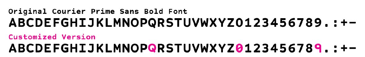
Considering the factors described above, we customized Courier Prime Sans Bold font for the automatic labeling feature of HP’s 3D-printing software. This font is available with a permissive license and it is brand neutral. We intended to use this font for creating labels optimized for MJF production, aiming for sufficient readability at any print orientation and also machine readability. We fixed the label size at 16pt (“A” is 3.37mm tall in this customized font) and used default kerning to make the outcome robust and readable on the roughest surface finish of the 180° print orientation. Also, we modified “Q” to be the same height as other capital letters to minimize the required vertical height, and we added a slash to zero and straightened the leg of number nine to make them distinguishable from similar characters for OCR and ICR.
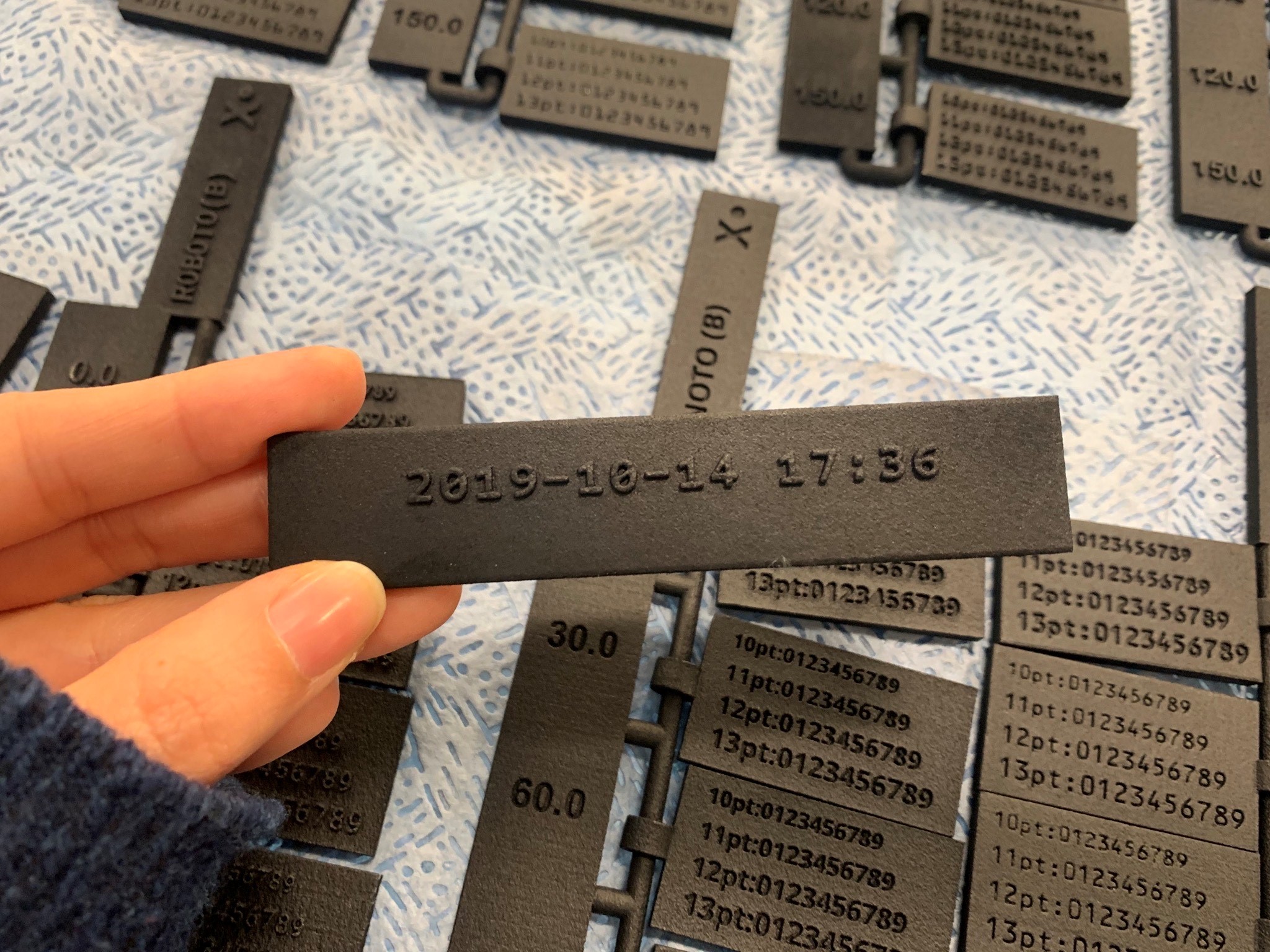
3D-printed part with an automatically generated timecode label using the cusotm font