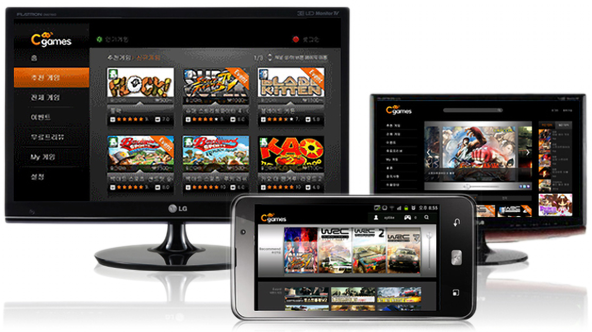
1. C-Games
Company: Amoeba Design (2012)
Client: LG U+
My Role: Market research, UI strategy & design, wireframes, and user flows
Client: LG U+
My Role: Market research, UI strategy & design, wireframes, and user flows
[Information Architecture]
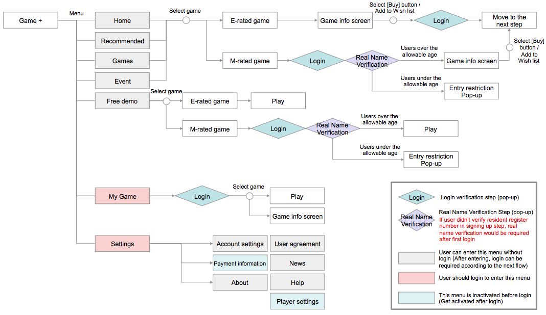
System structure & flow
The service on each platform has almost identical information hierarchies. A flow of the contents is analogously designed to provide a seamless experience to users who use the service switching platforms.
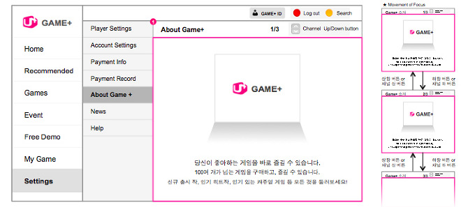
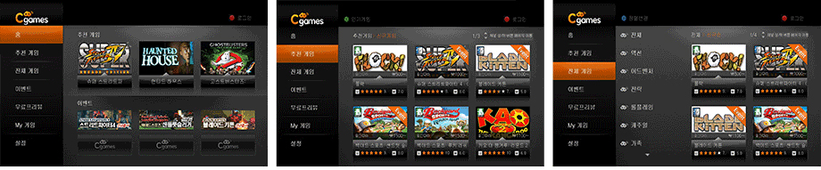
[Wireframes]
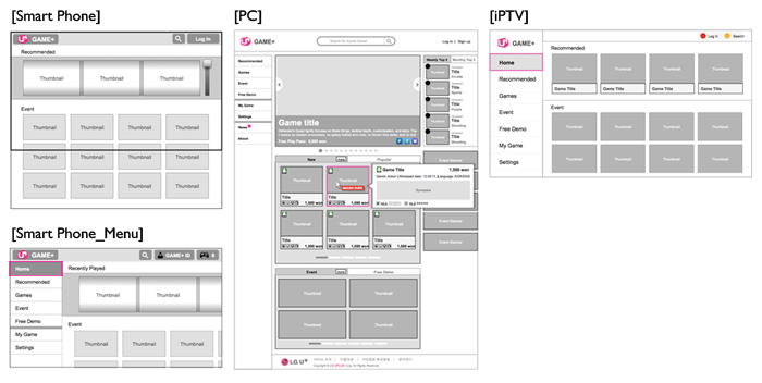
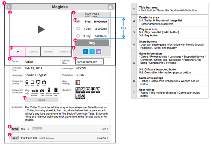
UI wireframes of main screens
Smart Phone: To provide a user with a screen view focusing on contents, menus are hidden outside of the home screen. A user can call the menu by tapping C-games logo button or by swiping the screen from left to right.
PC: Items are displayed on three columns, and a list of game items is expanded as default for users to browse them at a glance. A user can check a brief information of each game title with a context pop-up.
TV: The number of supplementary buttons are minimized considering a restrictive key controlling on TV. A user can perform a specific job quickly with function buttons on a remote controller.
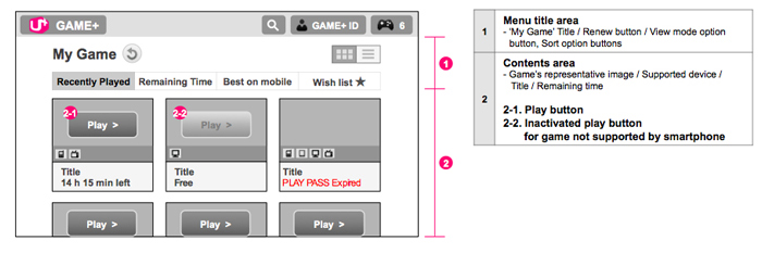
UI wireframes for mobile screen
UI wireframe for TV screen
[Final Products]
The final product was produced in collaboration with development and GUI teams, and it was launched on each platform successfully.
Mobile
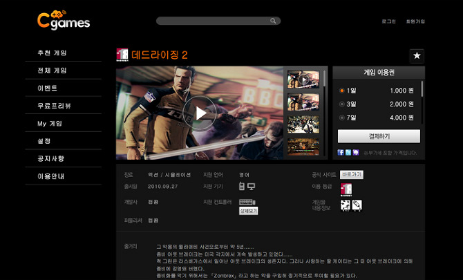
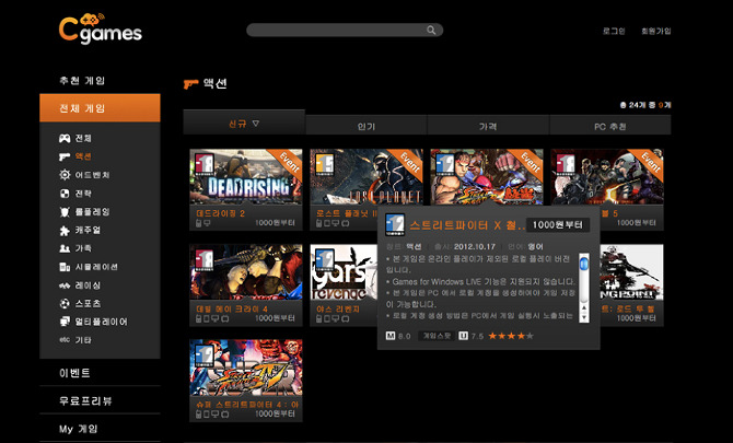
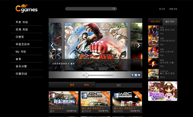
Web
TV
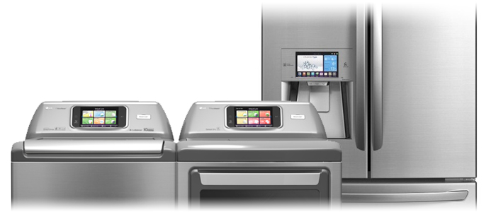
2. Smart Appliance
Company: Amoeba Design (2012)
Client: LG Electronics
My Role: brainstorming, designing wireframes and user flows based on the result of the usability test
Client: LG Electronics
My Role: brainstorming, designing wireframes and user flows based on the result of the usability test
The project entailed upgrading the previous version of a user interface of LG electronics’ smart appliance applications. The primary goal was to make a prototype application for the next model, and my team was responsible for improving the UI based on a usability test. I participated in the whole process and designed wireframes of the applications.
1. Usability Test
Recruited Users: married women between the ages of 30’s and 50’s who have a refrigerator, laundry machine, and oven.
[Hardware application for the smart refrigerator]
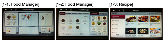
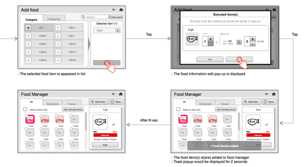
1-1. Food Manager: the process of adding new food item to application was too complicated.
1-2. Food Manager: summary of expired food items was needed.
1-3. Recipe: the user wanted to check cooking ingredient that were not saved in the Food Manager.
[Hardware application for the smart washing machine]
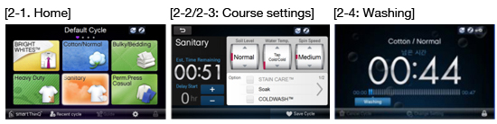
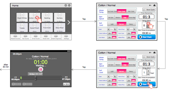
2-1. Home: washing time information was required for laundry course selection.
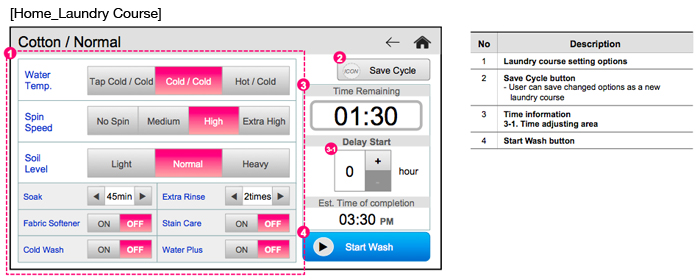
2-2. Course settings: the user wanted to see all the laundry options at a glance.
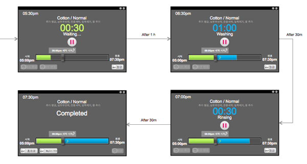
2-3. Course settings: the user wanted to check the time required for the completion of the selected course as well as the time for waiting.
2-4. Washing screen: an intuitive way of adjusting reservation time was needed.
2. Wireframe Examples
[Hardware application for the smart refrigerator]
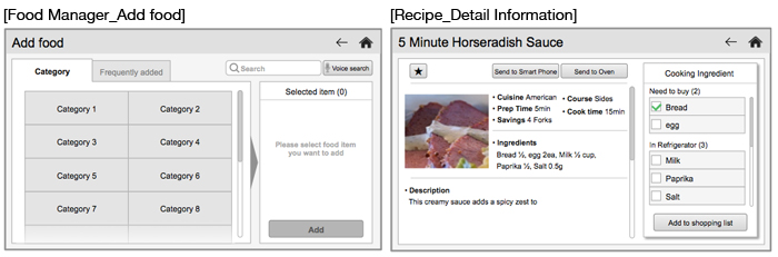
2. Recipe: for quick check of cooking ingredients to buy, we decided to show the contents of the recipe and filtered ingredient list at once.
[Hardware application for smart washing machine]
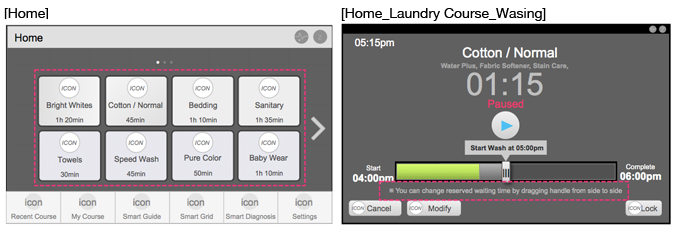
2. Home: we displayed the washing time information on the title of the laundry course according to the findings from the test.
3. Washing: originally, a user couldn't modify the reserved washing time after the washing started. However, by providing a handle on the status bar, we intended to allow a user to change the time setting more arbitrarily.
3. User Flow Examples