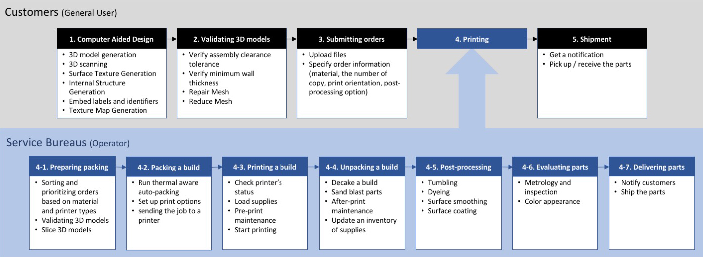
1. HPL 3DP Center Website
Year: 2020
Team: Jiwon Jun, Andrew Fitzhugh
My Role: Design Lead, Brainstorming, Wireframing, User Interface design, Interactive Prototyping, User Testing
![]()
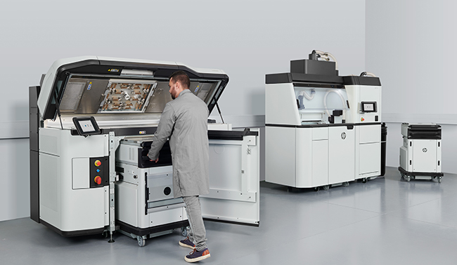
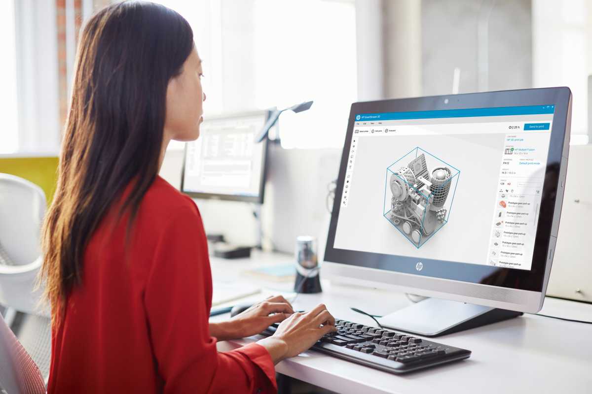
HP’s Multi Jet Fusion 3D printer is a production-ready industrial manufacturing solution. Its powder-based printing technology allows customers to produce a lot of 3D-printed parts at high speed.
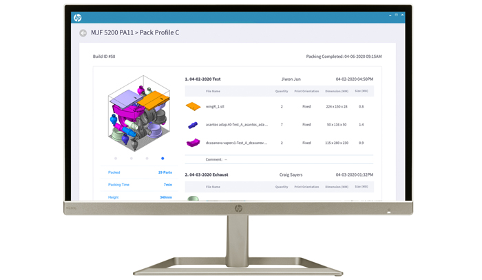
![]() Nesting is one of the tasks that need to proceed before each batch of printing. A printer engineer needs to prepare and nest digital 3D models to fit them into a printer bed size. Although some
software provides a feature to support the process, it still requires the engineer to manually rearrange 3D models to achieve better print quality.
Nesting is one of the tasks that need to proceed before each batch of printing. A printer engineer needs to prepare and nest digital 3D models to fit them into a printer bed size. Although some
software provides a feature to support the process, it still requires the engineer to manually rearrange 3D models to achieve better print quality.
Team: Jiwon Jun, Andrew Fitzhugh
My Role: Design Lead, Brainstorming, Wireframing, User Interface design, Interactive Prototyping, User Testing
[Diagrams]
Investigating 3D-printing workflows from start to end
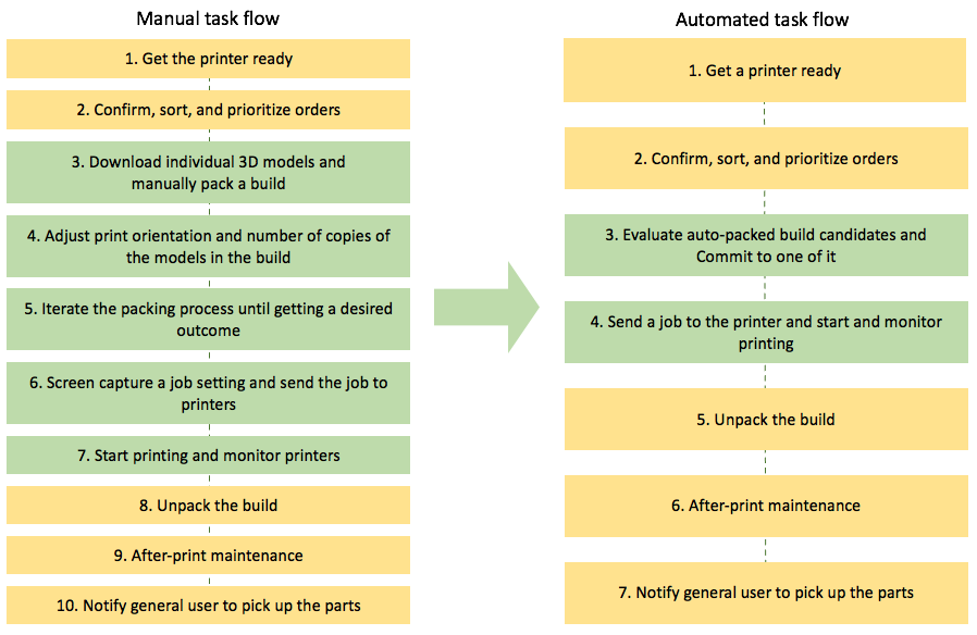
Redesigning the workflow based on users’ pain points
[Sketches]
[Wireframes]
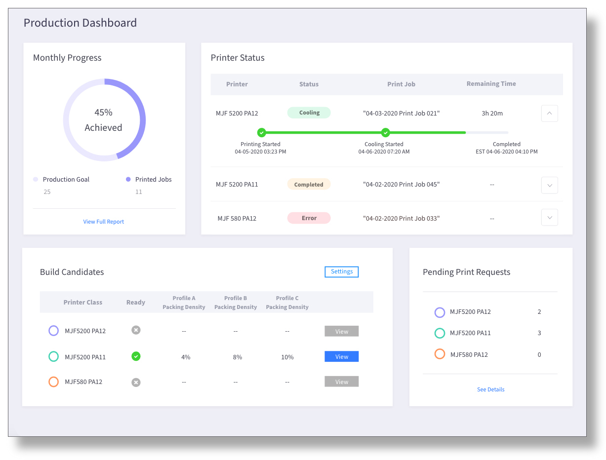
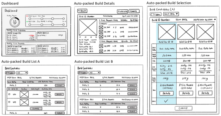
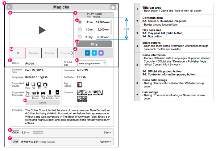
1. Dashboard
o Allowing a user to see all the status information of printers at a glance
o Providing details of the printer status with the expansion panel
o Providing a list of automatically nested builds and buttos for details

2. Auto-Packed Build Selection
o Allowing a user to compare production info of nested builds with different settings
o Providing an access to the detail page
o Allowing a user to select one of the builds to print
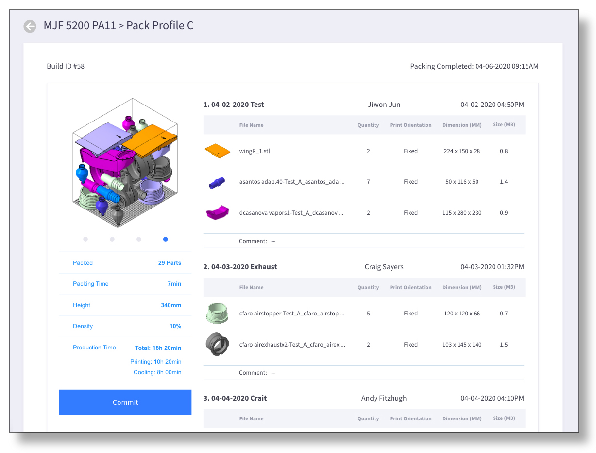 3. Auto-Packed Build Details
o Helping a user confirm estimated
production info of selected build
o Providing a list of the 3D models included to the build
o Allowing a user to proceed with printing by committing to the build
o Providing a list of the 3D models included to the build
o Allowing a user to proceed with printing by committing to the build
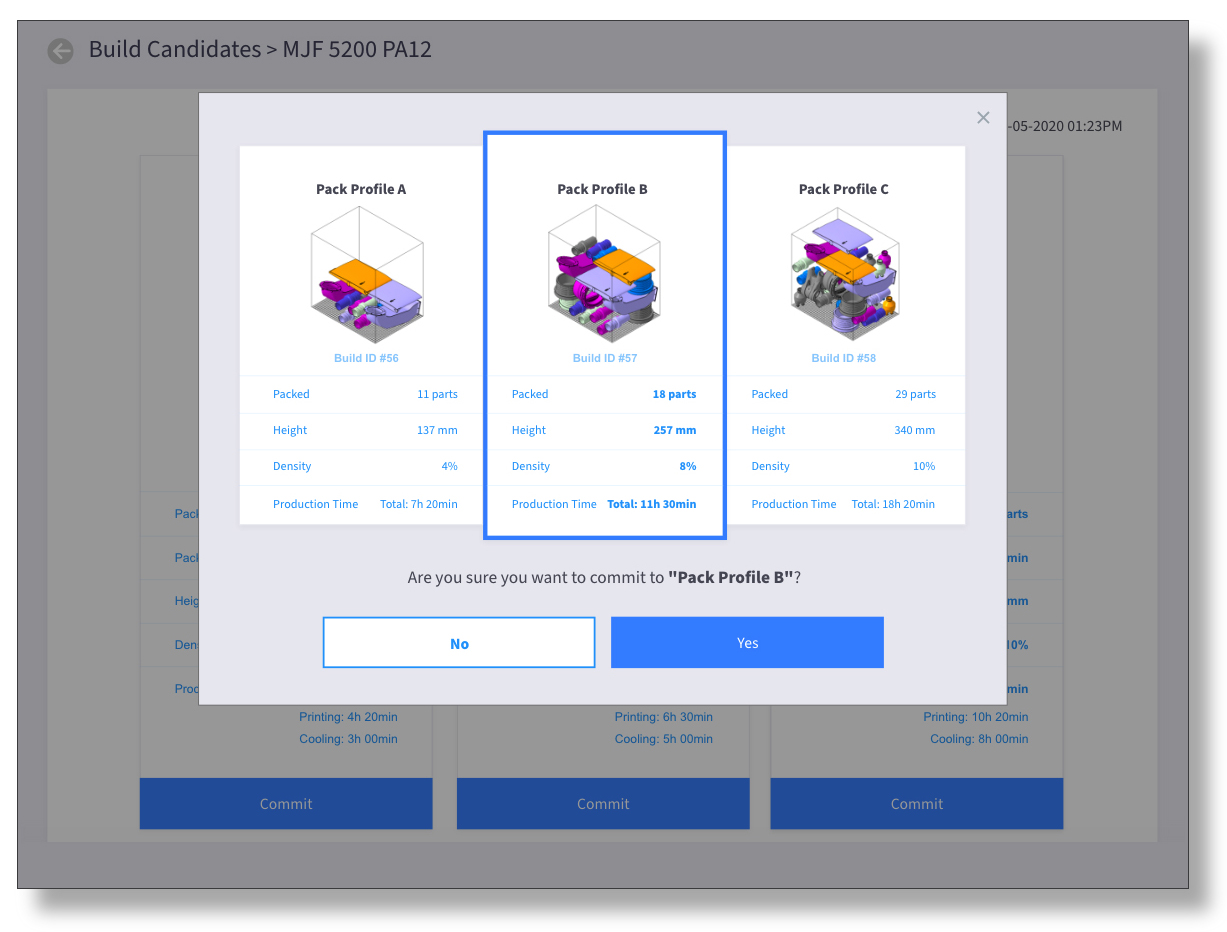
4. Auto-packed Build Selection Confirmation
o Confirming a user’s build selection before printing
o Highlighting the information of the selected build
[Interactive Prototype]
Interactive prototype used for virtual user testings
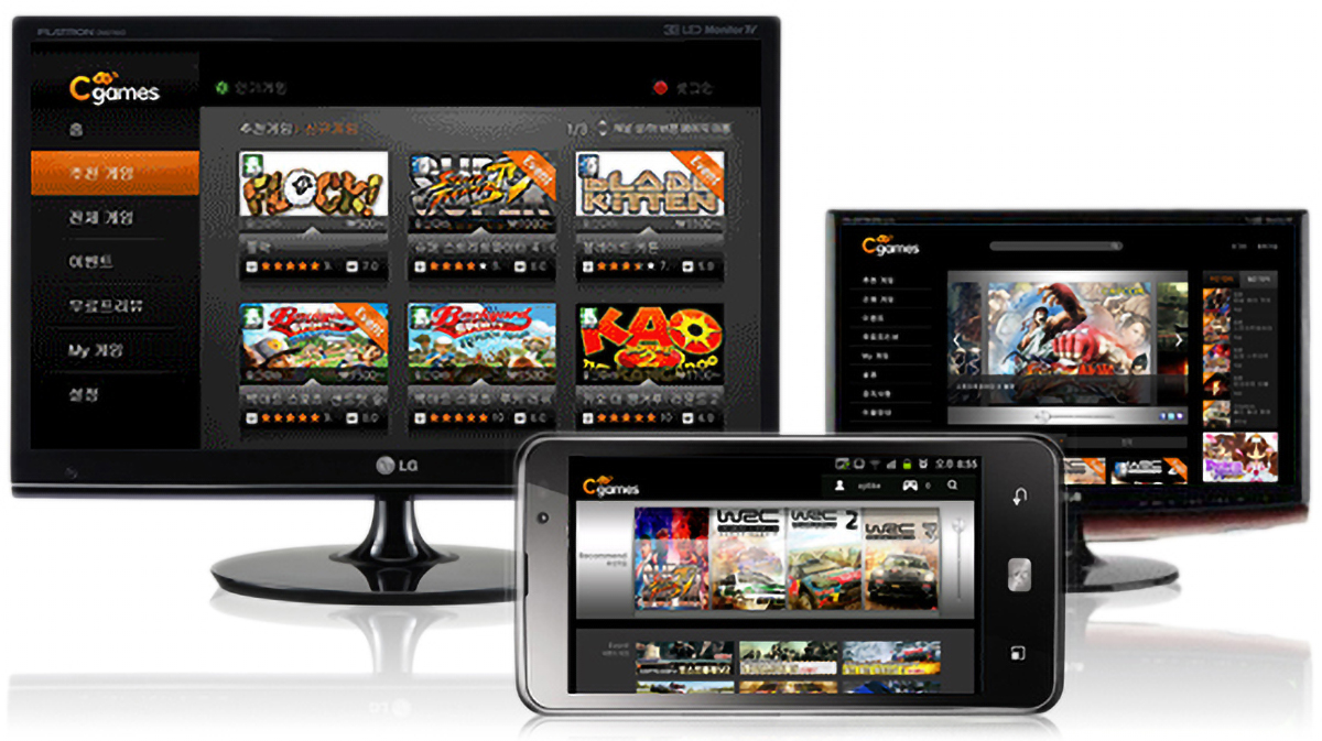
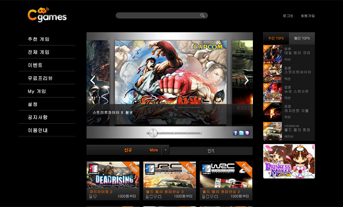
2. C-Games
Company: Amoeba Design (2012)
Client: LG U+
My Role: Market research, UI strategy & design, wireframes, and user flows
Client: LG U+
My Role: Market research, UI strategy & design, wireframes, and user flows
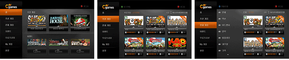
[Information Architecture]
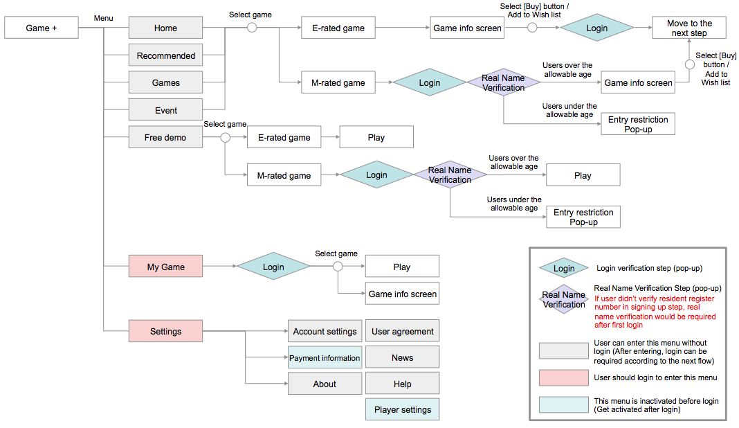
System structure & flow
The service on each platform has almost identical information hierarchies. A flow of the contents is analogously designed to provide a seamless experience to users who use the service switching platforms.
[Wireframes]
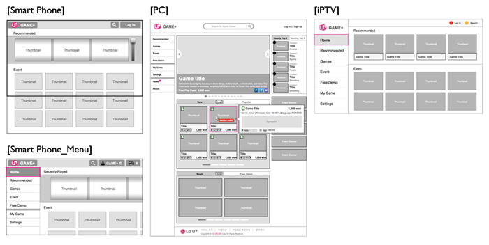
UI wireframes of main screens
Smart Phone: To provide a user with a screen view focusing on contents, menus are hidden outside of the home screen. A user can call the menu by tapping C-games logo button or by swiping the screen from left to right.
PC: Items are displayed on three columns, and a list of game items is expanded as default for users to browse them at a glance. A user can check a brief information of each game title with a context pop-up.
TV: The number of supplementary buttons are minimized considering a restrictive key controlling on TV. A user can perform a specific job quickly with function buttons on a remote controller.
UI wireframes for mobile screen
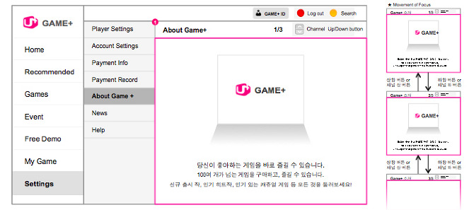
UI wireframe for TV screen
[Final Products]
The final product was produced in collaboration with development and GUI teams, and it was launched on each platform successfully.
Mobile
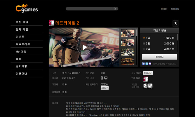
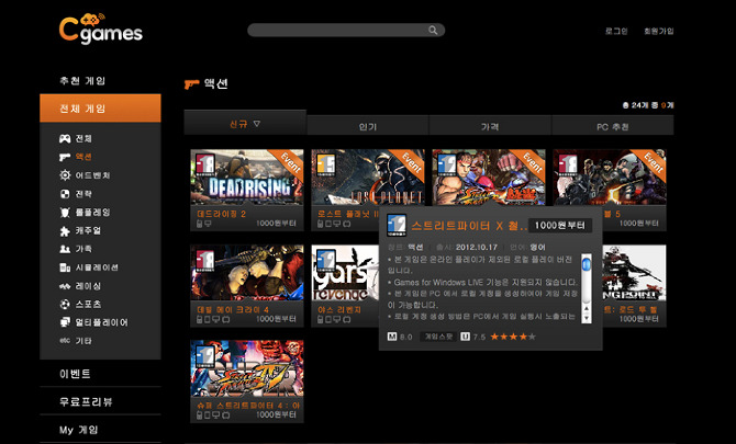
Web
TV
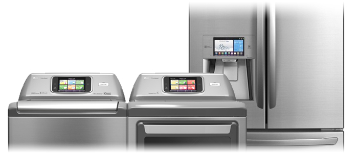
3. Smart Appliance
Company: Amoeba Design (2012)
Client: LG Electronics
My Role: brainstorming, designing wireframes and user flows based on the result of the usability test
Client: LG Electronics
My Role: brainstorming, designing wireframes and user flows based on the result of the usability test
The project entailed upgrading the previous version of a user interface of LG electronics’ smart appliance applications. The primary goal was to make a prototype application for the next model, and my team was responsible for improving the UI based on a usability test. I participated in the whole process and designed wireframes of the applications.
1. Usability Test
Recruited Users: married women between the ages of 30’s and 50’s who have a refrigerator, laundry machine, and oven.
[Hardware application for the smart refrigerator]
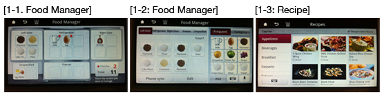
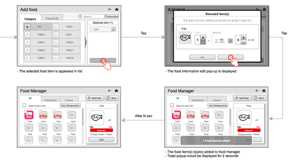
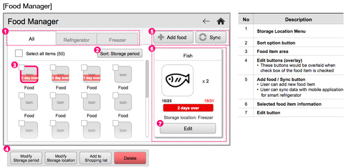
1-1. Food Manager: the process of adding new food item to application was too complicated.
1-2. Food Manager: summary of expired food items was needed.
1-3. Recipe: the user wanted to check cooking ingredient that were not saved in the Food Manager.
[Hardware application for the smart washing machine]
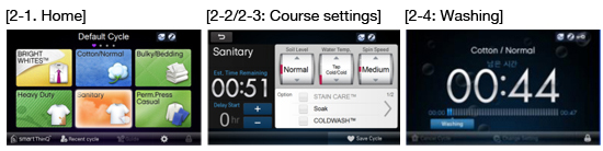
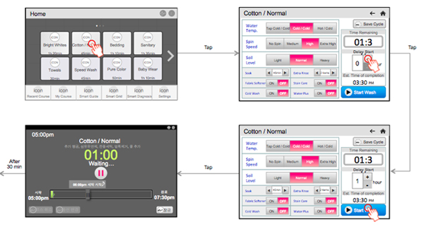
2-1. Home: washing time information was required for laundry course selection.
2-2. Course settings: the user wanted to see all the laundry options at a glance.
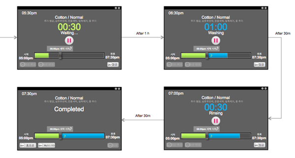
2-3. Course settings: the user wanted to check the time required for the completion of the selected course as well as the time for waiting.
2-4. Washing screen: an intuitive way of adjusting reservation time was needed.
2. Wireframe Examples
[Hardware application for the smart refrigerator]
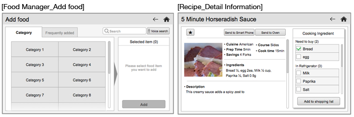
2. Recipe: for quick check of cooking ingredients to buy, we decided to show the contents of the recipe and filtered ingredient list at once.
[Hardware application for smart washing machine]
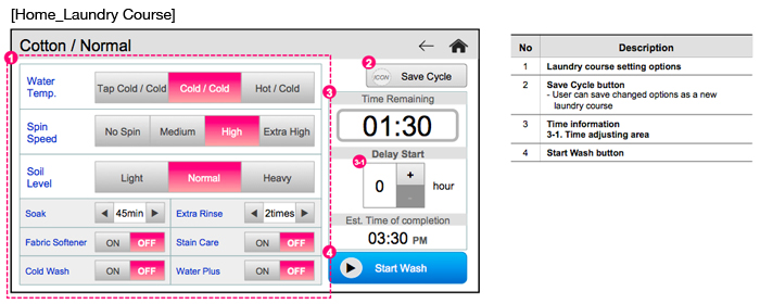
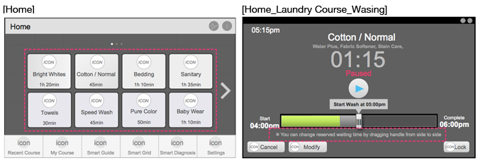
2. Home: we displayed the washing time information on the title of the laundry course according to the findings from the test.
3. Washing: originally, a user couldn't modify the reserved washing time after the washing started. However, by providing a handle on the status bar, we intended to allow a user to change the time setting more arbitrarily.
3. User Flow Examples